4 Ways To Increase Online Sales With Progressive Checkouts

If you’re struggling with low guest spending online, it might not have anything to do with your attraction. Adyen’s latest annual report discovered that 70% of consumers would not shop with organizations that have a bad online shopping experience. And mobile devices now account for over 70% of online sales.
Between these two statistics and your competitors, who are becoming increasingly tech-savvy, you need to ensure that your online experience dazzles your guests and makes them want to purchase more.
In this article, we go through four things your venue can do to increase guest cart size and ensure that those carts make it all the way to the final payment stage!
1. Ensure your checkout/website is mobile-optimized
Nearly three of every four dollars spent on online purchases today is made through a mobile device. It’s the new norm! Your guests are time-poor and always on the go, so they need to be able to access your offerings and make purchases quickly and easily via mobile.
And if a clunky, dated online experience greets them, 50% are unlikely to return to your website, let alone purchase from it.
Remember that you’re not only competing with the websites of competitor venues — you’re competing against the world's companies, like Amazon and eBay, who have set a new standard for guest online shopping expectations.
So if you haven’t already, this is your official notice to get mobile-optimized!
Expert tip: Check out PageSpeed Insights to see how your site performs on mobile. It may help uncover performance issues that keep guests from completing their purchases.
2. Make your online experience engaging with intuitive website design
Remember us talking about clunky, dated websites in the previous section? They’re definitely a no — and the same goes for unintuitive websites.
Your website and checkout experience must be engaging. As technology evolves, your guests are getting more accustomed to intuitive online experiences, and it is what they have come to expect from every company.
Ensure that you provide your guests with a rich visual website experience that effectively and accurately communicates your brand and generates excitement for your experiences. Curate a visual feed of immersive experiences for them to enjoy. After they are captivated by your website design, you can use calls to action to lead them into purchasing or purchasing more. But guests will only do so if they are enjoying your online experience in the first place.
The guest experience starts here, so make the effort!
Expert tip: Leverage your existing branding and imagery to foster trust — product images should entice the user. Avoid images with a lot of text, and consider showing real guests experiencing your activity.
3. Enhance your add-to-cart experience by making it conversions-focused
A checkout design that does not focus on increasing conversions will not give you the same benefit as one that does.
A conversion-focused checkout is enhanced to create fast and elegant interactions between your website and your guest. These interactions visually assure the guest of their action (adding an item to the cart) and coax them toward the next step of checking out or purchasing more.
Without such an intuitive design, the chances of your guest purchasing more decrease as they aren’t as engaged with your checkout experience. They are, therefore, less likely to want to buy more.
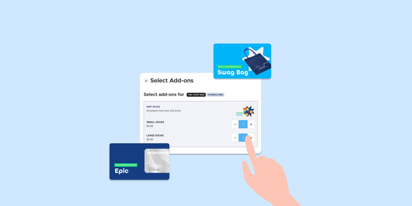
Expert tip: Look to reduce steps where you can. For example, introduce compulsory add-ons to the ticket package. And if extra details are required from the guest, request this after they have converted.
4. Share your checkout in an overlay
You know those overlays that pop up when you’re browsing a website that promotes sales/ discounts or asks you to consider signing up for their mailing list? Now you can do that with your checkout!
While your guest is browsing your page, you can share your checkout in an overlay that will remind them to purchase. Sharing your checkout allows your guests to conveniently and quickly purchase, eliminating the need for them to scroll, or navigate to, the payment section.
The displayed overlay encourages guests to purchase more as they can see their total in real-time, which is reassuring and more conducive to increased purchasing than a hidden total. It is also an exciting and modern way to display a checkout that your guests will appreciate.
You have spent a lot of time and money driving traffic to your website and promoting your experience with images and copy, so if you want an uninterrupted experience, use a checkout that integrates with your website, ideally as an overlay.
Expert tip: Use call-to-action buttons on your website that link directly to specific products. But also ensure you implement a global “Buy now” or “Book now” button that allows users to browse the product listing in the checkout.
Make spending easier and more enjoyable for your guests
As demonstrated in the sections above, increasing cart size comes down to making the browsing and online checkout experience more convenient for your guest. Make your guests want to purchase more by making it easier and more enjoyable.
Do this by creating an engaging and immersive checkout experience that is mobile-optimized and specifically enhanced to increase cart size.
Check out ROLLER’s new Progressive Checkout feature that does all of the above (and more!) and increase guest engagement, online conversions, and revenue at your venue today! Find out more here.
Related articles
.png)

Attractions Toolkit: 6 Marketing Automation Campaigns to Maximize Holiday Momentum


.jpg)
.jpg)
