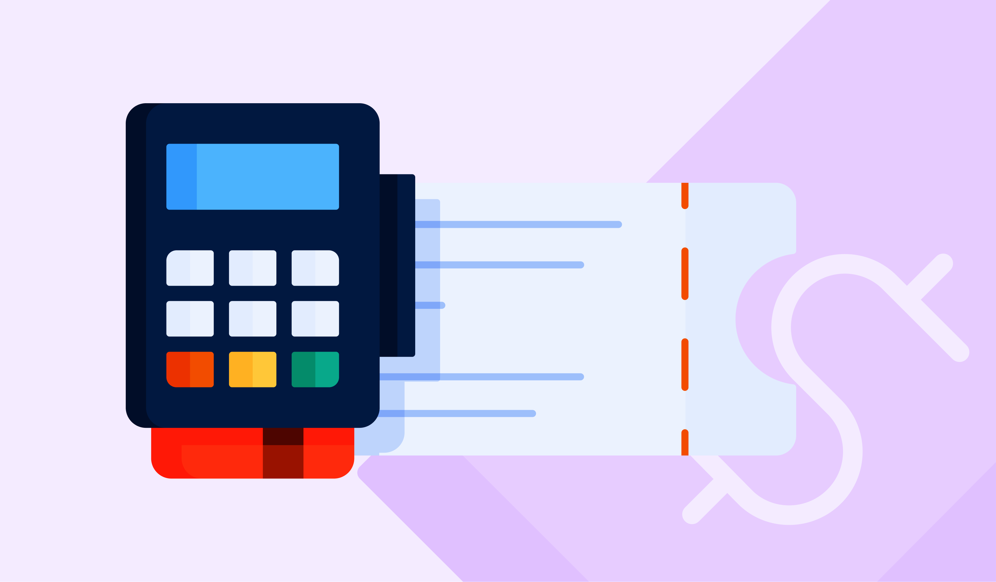
A day out at an amusement park is one of the most enjoyable experiences people can have. It allows for full escapism from our daily lives and creates memories that can last a lifetime. What isn’t fun though, is when there is confusion buying tickets. Ticket packages and pricing models have become so sophisticated in recent years that while it may be easy to understand within the organization and to those who created them, it often leads to friction in the experience, before the guest has even fully committed to buying. With most guests researching options and purchasing tickets in advance of their visit, you must look at the guest experience from the mindset of wanting to eliminate friction in how guests buy tickets online.
The “Buy tickets” button isn’t prominently positioned
Your website is a wealth of information for guests planning their visit to your park or conducting their research on your rides, shows, and attractions. The overall structure of your website is critical for guests to be able to find any information that they need - hours of operation, height requirements, show times, your outside food and beverage policy, and much more. However, you should ensure that you cater directly to guests who have made their decision to visit and drive their attention directly to your purchase page. A button that says “Buy tickets” or similar must be prominently positioned on every page on your website, in a location that is quickly identifiable and stands out from all other menus and dropdowns. This minimizes the number of clicks and seconds that it takes your guests from arriving at your home page to when they can begin buying.
The options are confusing
Business consultant Donald Miller, creator of the Storybrand framework, is known for saying, “If you confuse, you lose.” This often refers to overwhelming your customers with too much information from the beginning, right when they are looking at your ticket options, that causes the guest’s brain to put in more effort than necessary. While something like a “Lightning Package” or “Super Special” might have a nice ring to it, don’t let creativity exceed intuitiveness. Guests need to quickly identify the difference between a one-day ticket, annual or season pass, and what packages include food and beverage or express access.
Add-ons aren’t properly presented
The core product your guests should be presented with when buying tickets is park admission, and everything else needs to be categorized as an add-on. Parking, food and beverage combos, express or front of line passes, and VIP tours should be seen as ancillary items that are presented after admission tickets are confirmed. If express access does not include park admission, can guests purchase it on its own or does it need to be combined with a ticket purchase? If it’s available as a standalone transaction, are guests properly communicated the necessary detail that it does not include admission to the park?
The guest needs a printer or must pick up tickets at will call
In the early 2000s, offering tickets for sale online was considered a marvel that became the catalyst for the shift from buying onsite to buying in advance. Back then, being clunky was forgivable, because the world knew nothing better. For instance, picking up at will call was seen as a convenience, even though it required the guest to wait in line once they arrived, just the same as they would if they waited in line at the ticket window. Print at home was also a convenience that was highly regarded until younger generations ditched their printers and committed to being completely paperless. Now, with the general population armed with smartphones that can easily display a barcode or QR code, printing at home or waiting at will call are friction points that lessen the first impression of a guest’s visit.
Your mobile website is not optimized for commerce
In addition to going paperless, the population’s reliance on mobile devices has been apparent for several years now, and it continues to grow. Guests must be able to buy tickets on their smartphone or tablet just as easily as they would on a desktop or laptop. This minimizes the friction that guests need to buy - if they are out of the house and ready to commit, they must be able to do so easily. The more time that goes by between deciding to visit and starting the buying process can lead to second-guessing or considering alternative options, in which case you’ll have lost the guest before you ever even had them. Also, if a guest arrives onsite without tickets, sees a long line to buy, but your website is optimized for mobile, they can quickly and easily make the purchase on mobile and bypass the admissions window.
The more you focus on removing friction, the greater level of convenience you will provide to your guests. Greater convenience not only leads to more transactions, but it yields higher guest satisfaction, which can seamlessly turn into a stronger loyal fanbase. Don’t let friction points in buying tickets get in the way of the superior experience you provide.


